Monday, 29 November 2010

Music Magazine Project Planning

1.     Research and find definitions of the following Key Media Concepts – make sure that they’re linked to media studies:
·        Audience
-          The person/people who view the media. The media is a range of different things such as newspapers, TV, radio, magazines ect and these things gain more of a meaning when they have an audience. The audience purposes an opinion on the media and is crucial for communication. It is for the audience the media are constructing and conveying information.
·        Institution
-          The people who have a role in the production of media texts. Some may include: Companies/organisations, Producers, Distributors, and Marketing. So this means editors, directors, producers, scriptwriters, screenwriters ect.
·        Representation
-         Representation refers to the construction in any medium (especially the mass media) of aspects of ‘reality’ such as people, places, objects, events, cultural identities and other abstract concepts. Such representations may be in speech or writing as well as still or moving pictures.
·        Media Language
-          Technical media terms used to describe particular elements of the media using more correct and appropriate terminology.
2.     Why have you chosen to do the Print task rather than the Moving Image task?
I have chosen print rather than moving image because I did a moving at GCSE and I found it challenging so I decided to do print at a level because it gives me a chance to do something new and I am more interested in magazines and print formats rather than moving image. I would like a job involving print media in the future as I would like to become a journalist therefore I feel print would be more beneficial to me.
3.     Which skills will you need to demonstrate and develop in order to complete this project successfully? Think about technical skills (photography, use of DTP programmes etc.) as well as other personal skills (creativity, organisation, time management etc.).
I will have to improve on my photoshop skills as I find it hard to get used to photoshop as it is quite difficult and complicated to use. Also I will have to try and use my creative side more and think outside the box to be completely happy with my final design and make it original. Finally try and manage my time correctly to make sure each bit of the task is completed to the best standard possible by the deadline.
4.     What interests you about magazines and the magazine industry?
Magazines interest me because they give an insight about what’s going on in the world in a more formal and appealing way than newspapers. Most magazines just included gossip and fashion which may not seem very appropriate but it’s the way that the younger generation want to consume this information. Also magazines are interesting as they are usually bright, colourful and full of information that most teenagers/ young adults are interested it. As well as reading magazines I am interested and enjoy making magazines.
5.       Which genres of music are you interested in?

I am interested in different types of music. I listen to a wide range of music because I feel that it gives variety because listening to the same genre of music all the time may get a bit boring and repetitive. Although a listen to a variety of music the main genres I listen to are alternative, rock, pop punk, pop rock, electronic and some pop or hip-hop/rap but usually more rock styled music.
6.     Which magazines have you researched or are planning to research?
I am planning to research magazines such as Kerrang!, Rolling Stones, NME, Q, Mojo and Rock. I have chosen these as they are all magazines that I would enjoy reading and follow a particular house style that interests me.
7.     Which genre are you planning to produce your magazine for?
In my own magazine I will probably focus on the genre of Alternative rock and pop punk. I don’t want to make my magazine to categorise to one specific group of people but I want it to have a clear target audience.

8.     What is your intended target audience?
The intended target audience for my magazine is teenagers/ young adults who are interested in alternative/pop/punk rock music, roughly in the age range of 15-24. I want to make my magazine appeal to both male and females.
9.     What is the purpose of your magazine? Which consumer needs will it meet?
The purpose of my magazine is to inform people about the latest music news and keep people up to date with their favourite bands.
10.     List your initial ideas for the title of your magazine? Use a thesaurus or dictionary to help you with this. Your title needs to reflect/represent your genre and your audience.
-          Distractions
-          Silence
-          Rock and Roll
-          Demos
-          Echo
-          Escape
-          Encore
-          Paper walls
-          Untitled

Magazine Research Collage

To start off the research of my magazine I created a collage of pictures and words which I want to help echo the style of my music magazine. I first collected a range of magazines such as Kerrang, Q and NME.  These magazines follow the same sort of style as what I want my magazine to follow so therefore I thought these would be the best type of magazine to look at. These magazines also have the same target audience as what my magazine will have (15-24). These magazines have a clear house style to them for example using similar fonts, colour schemes and layouts. These are all elements I am going to consider when making my magazine. My making this collage it will give people an idea of the house style of my magazine and help to establish the target audience.
The type of images I used is images of musicians or famous bands that may inspire the people who will read my music magazine. I used bold and quirky texts that could be used to grab the attention of the reader. I wanted to make my collage have an element of fun to it so it represents that my music magazine will be enjoyable and easy to read.

Sunday, 28 November 2010

My Final Advert.

I decided to make my advert for the charity ‘Barnardo’s’ as this is a very successful charity who focuses on trying to stop child abuse. I took a variety of pictures and decided to use this as the image for my advert. This is the original image.


This is my final advert design.  I edited the contrast and brightness levels to make the background of the picture darker but the teddy stand out more as this is the most important part of the image. I then used the ‘Dry Brush’ effect from the filter gallery and this gave the image a sort of blurred look showing the insignificance you feel you have as an abused child. I then added in the text. I wanted to make the text jumping off the page. Therefore I used a bold font and changed the word ‘dark’ to a fluorescent green colour making it alert. The use of white for the main body of the text works well with the dark background making it stand out and then the contrasting green colour compliments this. The green is significant because in the dark the green fluorescent would colour would be seen in the dark whereas many children cannot make themselves seen or even heard in any circumstances. The font also looks like it is in front of the image relating it to the insignificance of children in abusive relationships. Finally I added the Barnardo’s logo to the bottom of the advert because it is important to know what charity the advert is supporting. The green and white colours in the logo compliment the colours of the text. The logo had a white background when I pasted it from the internet so I faded the background making the white words stand out on the dark background.

I decided to design another advert also for the charity ‘Barnardo’s’ because I wasn’t fully happy with the previous final design and wanted to make my advert more eye catching. This is the second image I chose to use. I think the fact that the doll is facing away reinforces the idea that many children suffering from child abuse try to hide away because they are ashamed of what’s happening to them and feel insignificant. Also the doll is alone and therefore isolated like many children in this situation. The doll stands as a metaphor for a child in an abusive relationship.  This is the original image before I began to edit it.

I used the ‘curves’ tool on Photoshop to drastically change the brightness and contrast levels of the image. This makes the colours on the doll stand out significantly on the page and bring your attention directly to this image. Increasing the contrast levels made the background of the image black just leaving a section of the carpet by the doll blue, giving the effect of a spotlight shining on the doll reflecting her isolation. I used white when choosing a colour for the text because white contrasts with the black background making it significant unlike the doll itself. I went on the website ‘DaFont’ to get an effecting font for my advert. I chose this one because it has an edgy effect to it but it still simple and stands out. I also included the Barnardo’s logo to the corner of the page to relate the advert to the specific charity. I faded the background of the logo into the image to make the words standout without a white background behind it because this looks more professional.

Friday, 19 November 2010

Photo Shoot of Toys

I decided i wanted to carry on with the theme of toys and child abuse for my final advert. Therefore i took some pictures of toys that i thought would work effectively in my advert to produce a professional and realistic charity advert.


Emulating a Charity Advert

I found this image on the internet so I decided to use it as the main image for my charity advert. I decided to stick with the theme of child abuse that I also focused on when analysing some adverts. I am using a child’s toy. I got this idea from the adverts that I analysed as many of the adverts i saw included childs toys, including one that i analysed.  I feel the use of childrens toys is effective so i choose to also use this technique. This is the original image before I edited it.


I then started to edit the picture. I increased the brightness and contrast levels to make the image stand out on the page and grab the audience’s attention. The colours on the dolls face now draw in your attention as colours are bright and contrasting making the image look more professional.


I then added in the slogan. I wanted to have a slogan that makes an impact. I chose to use the font ‘impact’ and have the text in a bold black colour. This immediately makes the text stand out on the page. The black text also contrasts with the bright colours on the doll. I then added the final text in. I made this text in a light electric blue colour. This brings out the colours in the dolls eyes. I also faded the main text ‘Break the Silence ...’ to give it a ‘cracking’ effect. I decided to make my advert for the charity ‘Innocent Ones’ which is a charity that aims to prevent child abuse. The charity wants to give children who are afraid to speak a voice. I though this was appropriate to my advert as my slogan is ‘Break the Silence...’ indicating the idea that children suffering child abuse are afraid to speak up about it. I chose to add in the web address of the charity. I wanted to keep a consistent colour scheme like on the previous adverts I analysed so therefore I had the address in the same blue colour as I previously used.

Tuesday, 9 November 2010

Analysing Charity Adverts

1) This is an advert for the NSPCC. The NSPCC campaigns to stop cruelty to children. I like this advert because it conveys a shocking message but in a realistic way. It is made realistic by using a child’s toy. A child’s toy is an everyday household object that could have been easily be damaged in one way or another but this toy has connotations of child abuse. The damaged toy stands as a metaphor for a child being beaten. The image is fairly dull and simple and I feel this is a good technique because attention is then focused on the message it gives rather than a fancy image.
2) This is an advert for ‘Innocent Ones’. I like this advert because it sends out a bold and clear message. Only 3 colours are used in the advert and all the colours contrast each other.  I think this is an effective technique to use as it makes the advert direct and to the point and not including a lot of detail but still grabbing the attention of the audience. Again I like the simple look that the advert gives making you focus your attention on the words and symbol ‘Stop’. I think this symbol is effective as it immediately makes you stop and think about the advert and the message its giving.
3) I like this advert as it isn’t necessarily shocking like a majority of adverts are its just taking a hard hitting subject and telling the truth. The text on the advert says “More child abuse is committed by the person a child trusts”. I think this is a powerful message because it’s solely the truth. Once you have gained a child’s trust, you can control them to a certain extent and some people take advantage of this. Also I think this is a successful image to clearly show this point. The child is holding on to the adult, but is gripping on to the end of their  finger not wanting to let go, whereas the adult is only holding out one finger showing that they are reluctant to want to protect the child. The image is gloomy and dull representing the loose unloving connection between the child and adult.  

Sunday, 7 November 2010

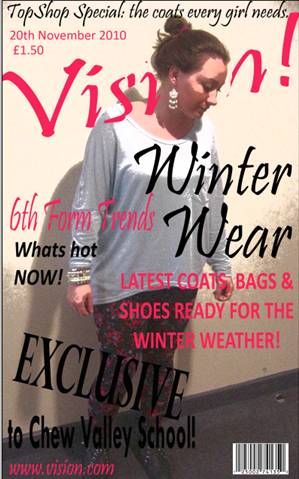
My final front cover and contents page

 Front Cover


Contents Page


Evaluation of my School Magazine

  1. In what ways does your media product use, develop or challenge forms or conventions of real media products?
My magazine follows many of the key conventions that are used in real magazines and therefore I think my magazine is a good representation of a real magazine.  Some of the typical conventions of a magazine that I have used are things such as including the date and price of the magazine and also including a barcode. Many magazines only use a few colours on the cover and try to keep on consistent style so it doesn’t look too busy or unclear. I have also included this technique on my magazine cover; I have used the colours black and pink. A selection of fonts is usually used in a magazine making the different coverlines and copy texts stand out and the use of bold fonts have the same purpose. Therefore I have made some of my texts bold and used a range of fonts, but keeping a consistent and professional style. 
2.      How does your media product represent particular social groups?
My magazine represents the social group of female teenagers/young adults. My magazine doesn’t represent a specific social group inside of the group of teenagers as I would try to explore a range of styles throughout the magazine.
  1. What kind of media institution might distribute your media product and why?
The type of media institution that might distribute my product would be Chew Valley School as I made this magazine specifically for the 6th form of this school as some information included in the magazine is specific to the school and 6th form. The magazine might be able to be ordered from the school website or brought through the 6th form representatives. This would then help to raise money for the school and therefore the money could go towards something specifically chosen by the 6th formers that would be beneficial to them.
4.      Who would be the audience for your media product?
The audience of my media product would be 6th formers that attend Chew Valley School. My magazine is aimed at a female audience as females are more interested in fashion and are more cautious about what they wear and how they look even though this is becoming more of a trend for males as well.
5.      How did you attract/address your audience?
I attracted the audience of female 6thformers by firstly choosing an image that would appeal to them. I took a picture of a 6th former that was dressed in casual but fashionable clothes. This means that other 6th formers can relate to the image. I also used a pink and black colour style. Pink is a stereotypical ‘girly’ colour, so I used this colour to specifically attract the target audience but I chose a more modern and professional colour pink that would appeal to older females, rather than a baby pink that is stereotypically aimed at young children. Also using a contrasting colour like black as the second colour gives the magazine a more professional and edgy look. 
6.      What have you learnt about technologies from the process of constructing this product?
From constructing the font cover and contents page of a magazine I have become familiar with the correct names for magazine terminology. For example labelling the different sections of my magazine with the correct terminology when making my flat plans and being able to easily identify different parts. Also I know the key conventions that the majority of magazines follow including things like the publishing information such as date and price. I have also learnt the basics of how to use Photoshop and I am becoming more fluent and confident when using this programme.
7.      Looking back at your preliminary task, what do you feel you have learnt in the progression from it to the full product?
Looking back at my magazine I think I have learnt a lot about magazines and how they are made. I am now familiar with Photoshop and this is a useful programme to be able to use. I tried to stick to the flat plans that I made the best that I could but I did include some elements on my cover and contents page that were not included in my flat plans. I think that my preliminary task of making a school magazine was very helpful and has gave me an insight of what is expected for the main task. In the end I was happy with the front cover and contents page I produced for the final product but I still think there is room for improvement when planning the main task.

Making my front cover and contents page

I am going to make a new magazine for my school. My magazine will be based on the fashions in the 6th form because I have an interest in fashion and as we are allowed to wear our own clothes in 6th form this is a relevant and interesting topic choice which would attract the target audience of the 6th formers at Chew Valley School.

I took some pictures of my friends that could be used as central image for my magazine cover. once i have selected the picture i will edit it, add in text and other elements to finally create a finished magazine cover which includes a range of fonts, colours and an overall style choice of my own. Then I will choose another image I would like to use for my contents page and do the same thing until I have a completed contents page for my magazine. I have done research into magazine covers which is going to help me present a realistic magazine cover.


This is the image that I am going to use as the central image for my magazine. This is the original photo before I started to edit it.


I then cropped the photo making the image appear more central on the page. I also added a filter effect to the image to make it look more appealing as the effect gives a more professional and eye catching look to the photo.


I slightly adjusted the brightness and contrast levels to make the image appear lighter and therefore making the image clearer.


 After adjusting the picture I decided to add the title name of my magazine. I chose to call my magazine ‘Vision’. I wanted to put the name behind the image as this is popular on many magazine covers. To do this is had to copy a section of the image out, then write the word and position it in the correct place and finally paste the copied part of the image back on top of the image.

I also decided to add the web address for the magazine at the bottom of the cover along with the barcode. This just makes the cover more relevant to reality.


I decided to add the main storylines in next. I tried to make all the different sections stand out individually and I did this by using different fonts. I wanted to keep a consistent use of colours as this is a technique that many magazines use. I chose black and pink because black stands out and is a statement colour and pink helps to appeal to the target audience of my magazine which is young female adults in 6th form.


I included the date and price of the magazine on the cover as this is a key convention that all magazines follow.
After a few finished touches my magazine cover was finished.
 
This is the image I choose to use for my contents page. This image has an edgy look to it and is eye catching so this is why I think it is good to use on the contents page.  This is the image before I began to edit it and turn it into the contents page of my magazine.


This is the image after I had edited it. I increased the brightness slightly and increased the contrast slightly more than the brightness. I like how the light colour of her t-shirt blends into the background meaning the signature pose stands out creating an eye catching look.


This is my final contents page. I wanted to make the page bold and attention grabbing therefore using bold fonts that match the bold and outgoing central image. I used a different and eye catching technique on the ‘contents’ label. This stands out to the audience so you can clearly see what the page is about. Also I included a repeat of the magazine name making it better known.  I continued with the same colour style and range of fonts keeping it consistent with the front cover.

Saturday, 6 November 2010

Photo Shoot

I did a photoshoot to gather a collection of picture that i could possibly use in my magaizne. I asked some of my friends if i could take some picture of them for my magaizne. I though it was a good idea to do this photoshoot with students that are in Chew Valley 6th Form as my magazine is specifically linked to this idea. They were wearing casual clothes that would usually be worn to 6th form and therefore this is very appropirate to my magazine about '6th FormFashion' as the clothes represent what is worn by 6th formers everyday.


Flat Plan for my contents page

Flat Plan for my front cover

Thursday, 4 November 2010

Emulating a magazine Front Cover

I am going to use this front cover of ‘Billboard’ magazine as inspiration and emulate it using my own style choices.
I like the way the image is central and overlapping the name of the magazine. The name is still clear and stands out because of the detail used in it for example the different colours in the centre of the letters. This is a successful technique as both the image and text are drawing your attention in.
Also I like the faded colour in the background because although it is subtle it helps with the overall look of the magazine as it stops the cover looking plain and boring. It also compliments the rest of the colours used in the cover making them stand out more.
One thing I don’t like about this magazine cover is that it doesn’t have much going on and therefore this makes it look bland and as if something is missing. It could be filled with more detail or a variety of different pictures.

Step one

I found this picture on the internet and am going to use this picture to emulate the magazine cover of ‘Billboard’ above that I liked the style of. This will help with my skills on Photoshop. This is the original picture.


Step Two


I edited the brightness and contrast levels of the picture to make it look more professional and edgy.
I also cropped the picture to cut out some of the background making the picture more central and eye catching.


Step Three
I cut out and copied the head of the image so I could put the magazine name behind the image and then paste the image back on top. This is a technique used by many magazines so the image remains the main focus on the cover.
I selected a font and colours that would compliment the fun and edgy style of my magazine. I decided to have the majority of the text in red and the ‘!’ at the end in black. This makes the name stand out from behind the central image and because it is unusual it is hopefully remembered.  I enlarged the text so it spread from one edge of the page to the other. Also I slanted the text to again support the overall look of the magazine.


Step Four
I added some text to the cover. I added a headlining name. I chose to use a celebrity as many celebrities are an inspiration for young women therefore this will encourage the reader to buy the magazine as they want to find out about the celebrities story. On the cover of my magazine I decided to focus on Lauren Conrad. I made this text quite central and overlapping the central image. This means the reader can associate the picture with the name. The text is also bold and in a contrasting colour to the picture and magazine name so therefore it stands out.
 I also added the website address to the bottom of the page. This is helpful to a reader as if they like the magazine they may want to look for more information on the website.

Step Five
I then added the date price and barcode to the cover. These are key magazine conventions and so appear on all magazine covers so I therefore included them on my cover.
I formatted the barcode in the bottom right hand corner and the date and price in the top left hand corner.


Step Six
When adding the main headline I wanted to make it bold and centred so that it is one of the first things you see when you look at the magazine. This helps to decide if you are interested in the magazine because if the main headline is interesting then you are more likely to buy the magazine to read the full article.
I also added two coverlines. One in black and one in red. This helps to keep a continuous style on the magazine by only using a few colours.

This is the final design for the magazine cover that i decided to emulate.
Overall i was happy with the final design but i feel that i could use space more wisely and add some more information. I will take this into account when making my final magazine.