Thursday, 24 November 2011

Print Screens!

Here are some print screen shots from out first day of filming!
This is a screen shot from one of my favourite clips that we filmed. The lights start viciously flickering and as the lights flash on you see the girls jumping together and the little girl peering round the corner. This is effective as the audience can see that the little girl is their, but the girls cant!

In this shot we are filming from the bottom of the stairs looking up to the upstairs landing. This is a low angle shot looking up at the little girl and gives the idea that the girl is of a higher status, she has the power to do what she wants too. We used dim lighting for this shot with just a light on downstairs to show that she is some where that she shouldn't be. The little girl walks across the landing and stops and stares in the mirror, with the lighting dim it gives a mysterious effect.


I think this is a very effective shot. The camera focuses on the girls just chatting and reading the paper, but then the camera zooms in on the light, and when it zooms out, the little girl appears behind them, spooking staring at them. This is again effective because the girl just appears out of no where, but the girls are unaware that she is there.

In this shot we wanted to create the effect of the camera being dropped and left on the floor, and then you just see the little girls wellie boots walking past the camera. We decided to use this shot to try and intimidate the audience, remind them that the little girls holds all the power. 

In this shot we used a simple dark room and a torch. The room was pitch black and we had the camera rolling, but at an unexpected time the little girl turned on the torch and shined it under her face. Each time she turned on the torch, we zoomed the camera in slightly so it gave the effect of the girl getting closer and closer to the camera. This is to make the audince feel scared of the little girl, and the unexpected flases of her face may again intimidate the audience.

Filming!

On Wednesday 26th October, we decided to start filming some of our trailer. The filming went well and we got some good footage that we can include in our trailer, but as we anticipated, there were a few problems, but these can be easily resolved.


We originally wanted the footage to be shot when it was beginning to get dark, to give a spooky feel to the trailer, but when we arrived at Jo's house and were ready to film we realised that, as it was early evening, the light was too dark and it was making the quality of the footage look poor, but we decided to carry on and make the most of the time we had.


Due to the fact that it was getting dark we decided to leave the outdoors filming for another day and get on with the filming indoors. We had a list of ideas that we wanted to try out and also had our storyboards to hand so we could remember what we had already planned down.


We had a lot of fun when filming the footage, and we found it easy to work with our actors as they participated well and listened to the information that we gave them, and also helped us develop our ideas further with their own input which helped a lot.


Myself and Jo shared out the work equally. We think that it is important that we both do the same amount of work so we spent a equal amount of time on the camera filming, and both participated when directing our actors. I think we work well together because we both have a similar vision of what we want at the end, and we share ideas well and then both talk to try and develop these ideas. This was an advantage to us when filming because we communicated well and tried out a range of idea which we can then look at in editing and come to a decision about what worked best.


Although we managed to get a lot of successful footage, when we put it onto the computer and were able to look at it properly, we saw that there was a lot of improvement to be made on some shots. We thought that this was going to happen, and it was beneficial to us because we can now see what parts worked and what parts we need to improve. We are therefore going to have another day of filming where we can shoot some new ideas and also re-shoot some bits that didn't go to plan first time.

Friday, 4 November 2011

Title and Tag-lines

We created a mind map of possible titles and tag-lines that we could use for our horror film. There are our initial first ideas and are planning to narrow these ideas down to a few that we like and carry out a mini questionnaire asking some peers which titles they like best and which tag-lines they feel will be most effective. We want an attention grabbing title that sticks in the audience's mind and a tag-line that is short and catchy, that sets the tone of the trailer. We want people to be drawn to the film by the Title and get them thinking with an effective tag-line.


After asking some peers which of the titles and taglines they liked best we managed to narrow it down to a possible two:
1. UNINVITED - You can run, but you can't hide!
2. CAPTURED - Expect the unexpected!

Thursday, 13 October 2011

Storyboard!

Here are the storyboards that we created for the initial ideas for our horror trailer. When we have shot all of the footage and begin to edit, we probably wont stick to exactly what we have planned in these storyboards but we thought it was important to start with storyboards to get our original ideas down so we know where to start when it comes down to filming.
We have included details about camera angles, music, position of characters in shots and movement. Jo and myself planned these storyboards together so both equally contributed to ideas and while i wrote down the directions, Jo drew the pictures.


Music

When watching a horror film I think that one of the most important things, when trying to create suspense is the music being played.  So I think that in a horror trailer this factor is even more important. A trailer is trying to sell the film to the audience so you want to create as much suspense as possible and this is done by music and sound effects.
We are going to use a combination of music and sound effects in our horror film. After watching many trailers we got an idea of they type of music we would like to use in our horror trailer. We liked the use of violins as they create an awkward suspense and have a spooky connotation. We want to use the slow sound of violins at the beginning of the trailer to build up the anticipation and then when the action picks up pace we want the music to mimic this and get faster and also louder.
We are also going to include sound effects to make the audience jump at the climax of the action. Some ideas we have already came up with are loud bangs, a suspicious ringing of the door bell, screams, a mysterious swing swinging in the garden and also scratching on a chalk board.
The song ‘Don’t Go’ by Bring Me the Horizon was a huge inspiration to us so therefore we are going include parts of this song in our trailer to create the suspense needed.  We like the violin part at the beginning (0.00 – 0.25) and also the more upbeat fast pace part more towards the end (3.04 – 3.31), so these are the parts we are most likely to use in our trailer.
Bring Me The Horizon - Dont Go


We also liked the idea of using a nursery rhyme in our trailer. The main character is our trailer is a little girl who haunts the girls living in the house so we thought a good idea would be to put a spooky twist on a nursery rhyme. We thought this would be a good idea because nursery rhymes have connotations of innocent sweet children so we want to make the contrast of this to show the little girl being far from innocent. We thought that ‘A teddy’s bear picnic’ would work or the ‘Freddie’s coming for you’ tune.

Freddy's Coming For You

Characters and location!

Characters
We are going to feature three main characters in our horror trailer; a little girl and two young students. The little girl is going to be played by Jo’ neighbour Evie Watkins and the young adults are going to be played by our friends Chloe Davis and Libby Akroyd. We chose these people to play the parts because we feel that they will take the task seriously and work well with us to successfully achieve what we want and will fit the parts well.  


Little Girl  (Evie Watkins) - This is the little girl that haunts the other characters in the house. She was murdered in her house, along with her mother, and is very protective of her house as she doesn't like it when intruders enter her house, as the last intruder in her house ended up killing her.


Young students (Chloe and Libby) - two young students who are house sitting while the family are away and have the job of watching the cat. While in the house strange things start happening and soon realise they are being haunted by a strange little girl.
Location
Location is one of the most important things to think about in a Horror film. We discussed a range of typical horror venues that we could possibly use for our trailer: the woods, a spooky house, a school, a forest but we thought we should go for a location that would be more realistic and achievable.
 The main location for our horror trailer is going to be in a house. The house we are going to use is Jo’s house. We thought this would be appropriate and achievable because all actors live near to Jo so they will be able to get to the location easily and we there are features in Jo's house which we thought would make a good horror atmosphere and create suspense.

Collage!

Focusing on the mis-en-scene of our film trailer, here is a collage of images/ideas that relate to the style that we want to create. Jo and myself sat down together at a computer searching for particular images that link with the ideas that we had talked about. We included images of costume, setting and props. Doing this has enabled us to gather further ideas which we can then include in our teaser trailer.


Group work!

For my coursework task, creating a film teaser trailer, I have decided to work in a group with my friend Jo Penney. We originally arranged to work in a group with two other friends but shortly realised that this wouldn’t work as it was too big of a group and would be difficult to distribute and split work equally.  We therefore decided to split into two smaller groups. I decided to work with Jo because we are both committed to our work, and are determined to work hard and achieve the best possible outcome that we can. We get along well and each bring a variety of different ideas which will benefit our work at the end.

Film Posters: Friday 13th!


  • This film poster is very eye catching as it has a mysterious and spooky feel to it. The edges of the poster are very dark with the light focusing on the centre of the image, making the image the direct focus of the poster; your eyes are automatically drawn to the image.
  • Like many other posters that I have looked at the image of the poster gets the audience thinking. You can see that the character is a human, but they are wearing what looks like a metal mask and carrying a sword and along with the fact that the lighting is dim, the audience are intrigued to find out more about the character and want to know his purpose in the film. The character in the image has very neutral body language and this is unsettling to the audience because it creates fear as you don’t know the full extent of his evilness.
  • The woods in the background of the image is a typical setting for a horror film, so this instantly getting the audience scared as the woods have connotations of fear with unknown creatures and terrible events occurring. The woods are also in dim lighting with the effect of fog or smoke around, this is adding to the suspense of the unexpected.
  • The title is in a ‘blood’ red colour. The colour red alone has connotations of danger, fear and blood so using this colour as the main colour on the poster of a horror film is very effective. The title stands out as the rest of the colours on the page are dull and dark colours so your eyes are drawn to the title, making it memorable.

Film Trailer: Prom Night!


  • I chose to analyse this film trailer because It is different from trailer I have previously looked at. The trailer doesn’t start with the common horror theme and I think this is effective. The trailer starts by creating that perfect Prom scene that every girl wants, with no connotations of horror included until the lights go out in the prom. From this moment on the audience are shocked as they have been waiting for that turning point in the film, the audience are now engaged with the trailer.
  • The music at the beginning is upbeat and energetic, which relates to the fun that should take place at prom, but this gets the audience thinking that its not going to stay so fun for long, and something is going to happen. The music then cuts out and a loud sound is used when the lights go out, this is the point of shock where the horror begins. The music then changes to a slower sound, which is quite high pitched.
  • When the music changes the screen repeatedly flashes black, in between which you see action of the characters all in shock and scared. After this a man feet appear at the top of the stairs. This is effective as the audience know this is going to be the ‘killer’ in the film, but gives a sense of mystery as you only see the feet of the man.
  • Similar to the other trailers I have watched, the trailer then picks up pace and cuts between action become faster making a more intense atmosphere. There are a lot of loud noises and screams that are used to shock the audience and this builds up the tension instead of fast, loud music that other trailers use.  

Film Trailer: Don't Be Afraid of the Dark!


·         I think this is an effective film trailer. It is different from all of the other trailers that I have watched and this makes it unique and effective, it means it is memorable. The first 49 seconds of the trailer is a plain black screen, with a simple voice over. The creates suspense as the audience are waiting for something to happen, something to make them jump and the longer it is just the black screen, the more suspense is created. It gets the audience on the edge of their seat, and this is good, it shows they are engaged with what’s happening.
·         The voice over is the part that makes the trailer have that uncertainty at the beginning. The words are spoken in a whisper, and the fact that you don’t know where the voice is coming from builds on the mystery of the trailer.
·         Having the title of ‘Don’t Be Afraid of the Dark’, along with already knowing that the genre is horror, instantly makes the audience feel scared. Many people are scared of the dark because it creates that atmosphere of uncertainty, you cant see very clearly so you don’t know what is there, or what is going to happen, so the audience are just waiting for that thing which makes them jump. 
·         The darkness is interrupted with a loud bang and the word ‘Don’t’ appears on the screen. This is used to shock the audience and I think it is effective. I think an effective technique used in this trailer is the action happening behind the words of the title. It gives a ‘looking through a key hole’ effect, from the perspective of someone else, but you don’t know who or what that someone else is.
·         The transitions are fast pace and fade through black quickly into the next shot. This is a common technique used in most horror trailers and one that I am planning to use in my trailer.

Film Poster: The Uninvited!


  • The colour scheme for this poster is very effective. Having a black and white colour scheme automatically gives a suspicious feel to the film and initially sets the genre so the audience know to expect a horror film. Black and white colours also give a sense of mystery as you don't know what to expect from the film; a typical convention of horror films.
  • The bars in the foreground of the shot give the effect of a window shutting something out and linking to the title 'Uninvited' they don't want the mysterious creature to come in. In the background of the shot there is the scene of a haunted woods; a setting which is again typical of horror films. This again links to the creature being 'Uninvited' as it makes the intruder seem as if they are outside maybe being looked at from the victim who is inside on the opposite side of the window.
  • The image is very central and is what the audience are instantly drawn to. The image is unidentified as you can't clearly see the face of the person/creature and the audience are left wondering what it could be and what things is it capable of.

Friday, 7 October 2011

Film Poster: Scream

As I am going to make a film poster and magazine front cover to accompany my film teaser trailer I thought it would be a good idea to analyse some and find out the key conventions included in them.


Scream!
·         The main image is very conventional for a horror film poster. It is a close up shot of a victims face looking scared. This type of shot captures emotion and draws the audience into the poster as if the central image is effective they are left wanting to know more about the film. The face of the character is white with no colour and could have connotations of the saying “as white as a ghost” when someone gets scared.
·         The title of the film is ‘scream’ and this is clear to the audience as it is the main/biggest writing on the page and is in a distinctive font. The font is spaced out and in a bold white writing. The audience want to know what the characters are ‘screaming’ about.  The ‘m’ in the tittle has the effect of a spike coming through the middle; this makes the title attention grabbing and memorable.
·         The colour scheme for the poster is dull and dark colours; black, white and a purply/grey.  This sets a dark theme and gives a sense of mystery. The poster has little lighting and the only well lit part is the central image making it centre of attention.
·         At the bottom of the poster there are names of some of the main actors in the film and also the name of the director. This could be a selling point as if the film includes successful and well known actors and directors then it may have high expectations from the audience making them want to watch it.
·         The tag line at the top of a film poster is very important. It gives a slight indication about what the film is about, so the audience can decide if they like the look of the film or not.  “Someone has taken their love of scary films to far. Solving this mystery is going to be murder”  this leaves the audience interested in the film and wanting to know more so therefore it accomplishes its purpose.

Thursday, 22 September 2011

Film Trailer: Strangers


  • This is my favourite horror film trailer and I am going to use inspiration from this video in my own work. I think this trailer is very successful and captures the mood perfectly. It gives an idea to what the film is about but at the same time doesn’t give away too much.
  • The trailer creates suspense with the use of effective music. The spooky slow piano tune at the beginning instantly gets the audience on the edge of their seat waiting for something to happen. The mellow atmosphere of the couple having a romantic meal is sharply interrupted with a loud bang on the door and this shocks the audience grabbing their attention. I think music is the key element in any horror film/trailer and the slow swinging of a rusty old swing is used often in the horror genre, and is used affectively in this trailer as it creates an unsettled atmosphere where the audience don’t know who or what is after the characters.
  •  I like the part when the music goes off and you just see a masked man appear behind the woman, this makes the audience want to shout out to the woman to warn her, the audience are engaged and paying full attention. The trailer then picks up pace going into more upbeat, loud music and faster transitions of shots. This picks up suspense and as the music goes off and a loud bang happens as an axe gets hit through the door, this causes the audience to jump as it was unexpected.
  • This trailer also has a successful ending.It ends with the woman asking “why us?” and the voice of a masked person repeating the films slogan in reply “Because you were home”. This leaves the trailer with an eerie atmosphere and the audience wanting to find out more!

Genre: Horror

I have chosen the genre of Horror for my film teaser trailer. I decided to choose this genre because horror films are one of my favourite films to watch as I like the suspense they create and how they keep you engaged and on the edge of your seat the whole way through. You constantly have something new to focus on so I wanted to see if I could achieve something of a genre that I enjoy to watch myself.  
“Horror films are unsettling movies that strive to elicit the emotions of fear, disgust and horror from viewers.”
 In my opinion there are two main types of Horror films. Some horror films include blood, gore and violence and others take more of a psychological approach and rely more on the aspect of suspense to keep the audience shocked and at the edge of their seat. I am going to focus on horror films that use the psychological approach and get inside the views head.

Conventions
Horror films often deal with the viewer's nightmares, hidden worst fears, revulsions and terror of the unknown. They usually include scenes which startle the viewer and repeatedly involve the intrusion of an evil force, event, or person, commonly of supernatural origin entering into the everyday world. Themes regularly interpreted into horror films include ghosts, masked people, werewolves, zombies, serial killers, haunted houses, demons, vampires and curses.
The genre of Horror is so broad I am looking forward to interpreting horror in my own way and producing a convincing teaser trailer which leaves the audience with chills.

Thursday, 14 July 2011

Year 13 Media - Brief

A promotion package for a new film, to include a teaser trailer, together with two of the following three options:
  • a website homepage for the film;
  • a film magazine front cover, featuring the film;
  • a poster for the film.
Out of the selection on 13 briefs i have chosen to make a teaser trailer for a new film as it interested me most. I studied Media at GCSE and AS level and after focusing on film last year i feel this is an area of the media which i can show my strengths as well as challenge myself.

In GCSE i made a music video which gave me some experience in moving image, which i enjoyed, so therefore i would like to broaden my knowledge and learn how to use more advanced technology involved in moving image.

This brief also appealed to me because it gives the opportunity to make a magazine front cover and a film poster for my film teaser trailer. I enjoyed making a magazine at AS level so would look forward to this aspect of the task and be able to use the skills i gained from last years work.

Thursday, 28 April 2011

Final Double Page Spread & Analysis


This is the final double page spread for my music magazine. I chose to feature my friend Fran Caines in the article as she is the lead singer of a new punk –rock band called ‘Same Thing Different Story’. I thought that this would be a relevant and appropriate feature to include in my magazine as the band is fresh and new so therefore fitting into the “Bands Not Brands” motto my magazine has, and the punk – rock genre of music is relevant to the genre and style of my magazine.
When creating my double page spread, the hardest part was choosing an appropriate colour scheme. I already knew the layout and images that I wanted to use but trying to find the right colours that worked was challenging. I already knew that the image included black and white on the clothing and an orange/wood effect on the guitar and Fran’s hair. Also band logo is in black and white. I knew these colours fitted with the colours I had used on the previous pages of my magazine so I then had to decide on two other colours to use on my double page spread to keep it consistent with the other pages. I chose a gray background because I had already used black on the two previous backgrounds so I wanted a change and therefore chose grey. I then decided on green as the first bright colour. I chose green because it hadn’t yet been used in my magazine and complimented with the grey background. I originally had the three boxes behind the secondary images all in white but I realised this made the page look to plain so I decided to leave one white, have another a slightly lighter shade of grey and the final green to match the strip down article. I finally chose to have the significant writing in an orange colour as coordinated with Fran’s hair and the guitar.
I decided to have a green strip down the centre of the article to break up the writing so it is easier to read and take in, one big block of writing doesn’t look appealing to anyone. I also decided to include a quote from the article as this is common feature that most magazines have. It gives indication the reader what the whole article is about, and if they are interested in that one quote they are more likely to take the time to read the whole article. I chose to use a slanted font for the quote and put it on a white block background and have orange quotation marks around it so its stands out on the page.  
The choice of images on the page is very important; they need to be fun and eye catching. I chose to have the main image as a full shot of Fran holding a guitar and pulling a funny face. This shows personality and will make the reader interested in the article. For the secondary images on the page I used two full shots and one medium shot of Fran, I wanted a variety and not all the same shots. I think the effect of Fran wearing ‘geek glasses’ makes the images look fun and relatable.

Final Contents Page & Analysis


This is the final contents page of my magazine. When I first had this idea for my contents page I thought it would be challenging and I wouldn’t be able to accomplish it as well as what I did, but in the end it turned out just as I planned.
I wanted to keep a consistent housestyle to my magazine and therefore again I chose two colours to use on the background colour, this time I decided on purple and orange because they complement each other even though at the same time they clash. Instead of just using one plain background colour I decided to have the effect of a jagged split down the page, leaving half the page white and changing the other half to black. I did this by using the ‘paint bucket’ tool to create a block of black and then I used the ‘eraser tool’ to erase some of the black to leave a jagged edge.
I repeated the masthead ‘Untitled’ on the contents page and used the trademark font so that it can be identified. I also used this same masthead design at the bottom of each page alongside the page number. Under the main masthead on the contents page I added a pull quote ‘Bands not Brands’. I chose this phrase because my magazine is going to feature bands as they are new on the scene and therefore haven’t been heavily influenced by the media and are making music for their love of music and not just for the money, which some bands/singers have resulted too. This is in black and white and a statement font. The lettering looks like it has been cut out of a newspaper and stuck down. I think this is effective because it shows variation and not just the same old standard fonts. The contents sign is also in black and white, this is creating a realistic colour scheme that doesn’t make the page too hectic.
The image is placed on the white side of the split background. Due to the black clothing the model stands out on the white. She is slightly leaning in as if she wants to get to know the reader and show what the magazine is about. She is holding out her jacket and showing the Rolling Stones logo, this is also indicating the rock theme.
My favourite part of the page is the ‘This Week’ lettering. I think it is fun and eye catching to the reader. I have duplicated the writing and alternated the colours of the letters so they are at contrast with each other and this makes it stand out. This is the main feature of the page as it is where the reader has to look to find out what’s in the magazine so I think it’s significant that it stands out.
I have kept to the same colours of orange and purple when it came to the writing on the page. I thought it was best for the main body of the text to be clear so when on the black background I changed the writing to white so it would be clear, and when on the white background I alternated it and had black writing as that would be most visible. If I had changed the writing to orange or purple it may have looked like too much detail and might have become unclear. I used orange as a background colour to the subheadings and purple as the page number to keep the colour scheme consistent and the page to look fun.

Final Front Cover & Analysis


This is the final front cover of my magazine. I struggled with aspects of it such as trying to get the arrangement on the page correct and choosing the colour scheme but overall I am happy with the final product.
I chose to have a dark colour scheme to my magazine as it fits with ‘rock theme’ that I wanted my magazine to have. Therefore I decided to have a black background and then accompany it with red, blue and a white masthead. After varying the colours a lot, I feel in the end the colours complement each other and the cover on a whole works.
I used many of the main codes and conventions that most magazines follow such as a significant masthead, an eye catching central image, some secondary images, a skyline, a side bar, magazine details and a barcode. It is essential to include features like these otherwise my magazine would not be realistic look like a real magazine.  
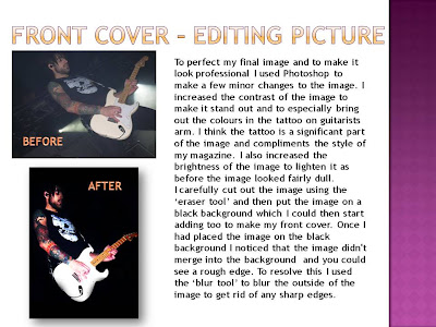
The image on the front cover is one of the most important features to a magazine. It tells the reader what sort of stories are going to be included inside, due to the storyline that goes with it, and helps to set the theme of the magazine. I chose this image because I think the guitarist is at an interesting angle and I like how you can see the clear detail on his tattoo; I think it is one of the most positive aspects of the image. I increased the contrast of the image to bring out the colours in the guitarist tattoo. I think the tattoo helps to set this ‘rock theme’ to my magazine and fits perfectly with what I was hoping to achieve. I like how the guitar draws in your attention because it is a bright white and overlapping the other images. It complements the white masthead ‘Untitled’ and the band name ‘Boys Like Girls’ as they are the most significant things on the page.
I used the online font website ‘DaFont’ to get the front of my masthead. I tried out a selection of fonts, as shown previously on my blog, until I found one that I felt would go with the theme of my magazine. I wanted it to be interesting and not just in a standard boring font because that wouldn’t catch anyone’s eye on the shelf, and as it always going to be identifiable with my magazine it needs to be effective. I therefore used an eroded font where the letters are slightly positioned out of a straight line. This adds personality to the masthead.
I chose to have a skyline because I think it is very common in magazines. I got the idea of having featuring band names between stars from a cover that I had previously looked at. I think it works well with my page and subtly adds more detail and colour.

Monday, 25 April 2011

Research - Photographer

Nigel Barker is a sucessful Englsih Photographer. He started his career as a male model in England and quickly made is name known world wide and started working for  big names such as Giorgio Armani, Ralph Lauren, Donna Karen and Valentino!

Barker then changed his career path and switched to the other side of the camera and by 1998 was a famous fashion photographer and had opened is own photo studio in Manhattan, New York. He later became a judge on the pannel of America Next Top Model and worked besides big names in the industry such as Tyra Banks and Twiggy Lawson.

I think he is a very talented photographer and i like the style that he uses. His images are always very eqgy with a specific effect thats grabs your attention. The model is always gracefully captured and centre of attention. I like how he uses a lot of back and white effects and uses alot of subtle colours but the image still stands and looks interesting.

This is a link to Nigel Barkers official photography Website http://www.studionb.com/

Flat Plan - Double Page Spread

Flat Plan - Contents Page